Alior Bank Poland, Warsaw Building Photo, Design, Polish Project Images
Alior Bank Warsaw, Poland : Architecture
Banking Development by Robert Majkut Design architects
22 May 2009
Under Alior’s wings – new Private Banking network designed by Robert Majkut Design for Alior Bank Poland is now open
Design: Robert Majkut Design architects
Alior Bank Warsaw
Description from Robert Majkut Design:
The entry of Private Banking Alior Bank on the market demonstrates that the target group of PB sector is continuously growing or that it is subject to progressive changes, increase or diversification of assets and that new partners are sought to manage assets and investments.

The establishment of another Private Banking is the symptom of the continuous trend that is changing Polish society, which is successively getting wealthier and generates the demand for highest quality services, including the financial services.
Alior Bank’s Private Banking Centre photos by OLO STUDIO
It should be noted that wealthy people due to the level of their possessions are most experienced and world-wise social group and frequently they are the consumers with sophisticated style. They are the customers of good and recognised brands, frequent travellers, who accumulated the wealth of experience and enjoying high comparative spectrum. In short they are people who are aware of their needs.
When a bank makes the decision to enter this demanding sector it implies the existing market absorptiveness and that there is still room for new proposals and products. The decisions of this type are even more important, when they are made at times of slower market development, because a wealthy client is considering even more the appropriate method of management of his capital, because the times of crisis means high losses for some, while for others mean great opportunities.
Under such market and social circumstances we were given the task of creating a new design of Private Banking outlets for Alior Bank.
The main assumption of the project concerned the development of the very characteristic and strong bank’s identification created by White Cat Studio, which received the prestigious Golden Eagles 2008 award.
The identification is based on three basic colours: crimson, yellow and white and is styled as an old drawing – the face of an angel. This is the element so characteristic that it became the starting point for further graphic works and studies, which are included in the design.
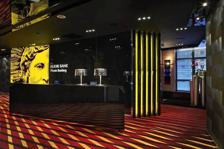
Obviously the interior design concept of Private Banking outlets had to be supplemented and required designing the elements, which would differentiate it and appropriately position to differentiate it from the retail outlets. That’s why black instead of crimson was incorporated into the sign, which is well composed with the other newly selected supplementary colours such as the shades of copper, greys and graphite.
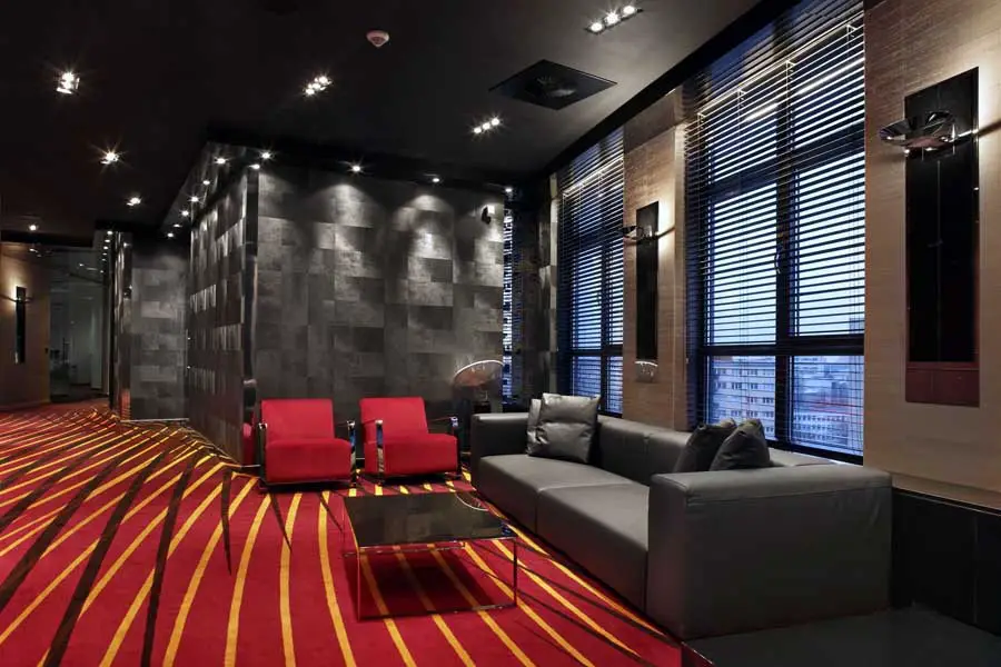
The graphic linearity present in the design appears not just in the rescaled logo dominating the reception zone, but is also included as the characteristic pattern on the carpet multiplying the effect of perspective in space and referring to the effects observed in the sign.
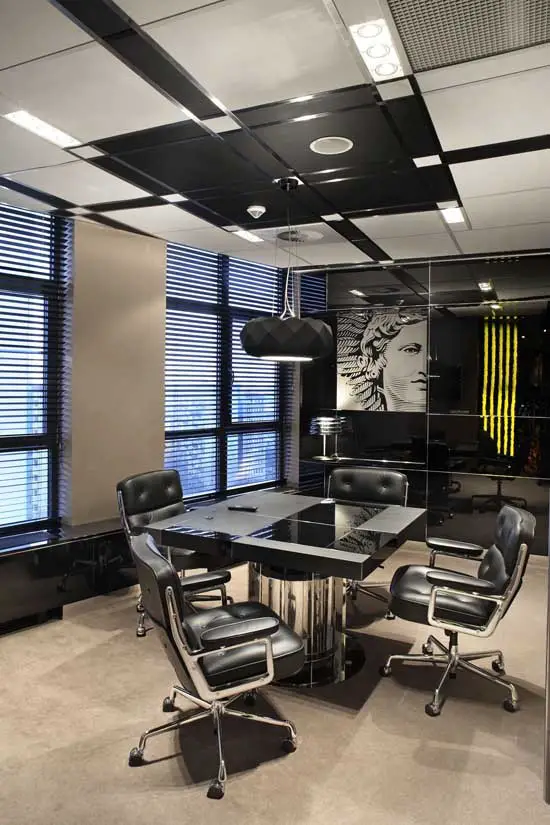
Another aspect of the design transplanted from the visual identification concerns the shape consisting of two arranged squares. As a starting point they became the leading theme of all forms and shapes of the interior reminiscent on one side of the paintings of Piet Mondrian and on the other side of the already classic Bauhaus school.
The rhythms of lines and geometry of the appearing and overlaying squares create the internal divisions starting from the main space plan and finishing on the furniture detail of the conference table top. The linearity and rhythms of the squares became the pretext not just for the development of the forms but also for the purely decorative effects.
In addition to the obvious image consistency, its declinations and enhancements in the concept of this interior design we wished to refer to the classic office interior style of the forties and fifties observed in American offices from the times of prosperity and diversified economic development. Thus the presence in the design of many references to the interior and elements of that era, which today are already a part of the designing classics.
However the consistent high quality of the composed materials seems to be the most important feature. The entire scheme is dominated by black found in the form of embossed wallpaper, piano lacquer of the furniture and built-ins, glass or leather of upholstered furniture. All this is interlaid with the strings of polished steel, silk wallpapers in the shades of copper and the thick high quality carpeting.
The entire reception area including the customers waiting room is a contrast between the black ceiling and the walls and the patterned crimson carpet. This two-colour scheme also preset in the equipment and materials of various structures and polish was cut by the yellow plane of illuminated logo multi-reflected in the polished interior elements.
The dark coppery colour of the silk wallpaper softens this contrast and announces the colour scheme used in the office rooms.
The anthracite translucent glass doors hide offices dominated by polished black walls with the engraved logo, rhythmic square ornamentation of the table with the classic furniture from the thirties placed on a plain carpet in the harmonized colour identical to the silk used to cover the walls. The rhythmic black and white ceiling describing the interior and arranging its symmetry is additional effect observed in the office rooms. The meeting rooms are equipped with modern lighting and the furniture incorporates built in equipment enabling multimedia work and presentations.
All places, where the professional services are provided, require the support of strategic design. A good design is not a whim today, but primarily a required material element of high standard of provided services. Nowadays the design is not just an image creation element but also the material element of competitiveness. It is not the application of the design alone, but its high quality and sophisticated solutions that create the desired added value. Robert Majkut Design is a leader on the Polish market in the implementation of these types of projects and the effects of RMD working together with the investor become one of the elements of both image and primarily the business success of the investor.
Alior Bank Warsaw Poland images / information from Robert Majkut Design
Robert Majkut Architect
Location: Warsaw, Poland
Warsaw Buildings
Warsaw Cinema by Robert Majkut Design
Warsaw Architecture – Selection
Architecture: Goettsch Partners
photography © Sebastian Deptuła, Anatomia Formy
Mennica Legacy Tower Warsaw
Zlota 44 Tower in Warsaw
Design: Daniel Libeskind Architect

image courtesy of architects
Zlota 44 Tower Building in Warsaw
Zlota 44 Warsaw
Design: Studio Daniel Libeskind
Zlota 44 Warsaw
Lilium Tower
Design: Zaha Hadid Architects
Lilium Tower
New British Embassy
Tony Fretton Architects
UK Embassy in Poland
New Polish Architecture
Contemporary Polish Architecture
Polish Architecture Designs – chronological list
Architecture Walking Tours Poland
Polish Architect : Robert Majkut Design – contact details
Polish Architecture – Selection
Comments / photos for the Alior Bank Warsaw Poland Architecture page welcome