
Light and colour in architecture guide, Building lighting design style, CRI advice, Visual mood color quality
Light and Colour in Architecture: How Light affects Colour
post updated 10 February 2024
Over the years, famous architects have employed the use of light in enhancing their designs. Light in architecture goes beyond just functionality to transforming architectural designs into works of brilliance. Similarly, colour brings the architecture to life, creating the right mood and allowing for visual comfort.
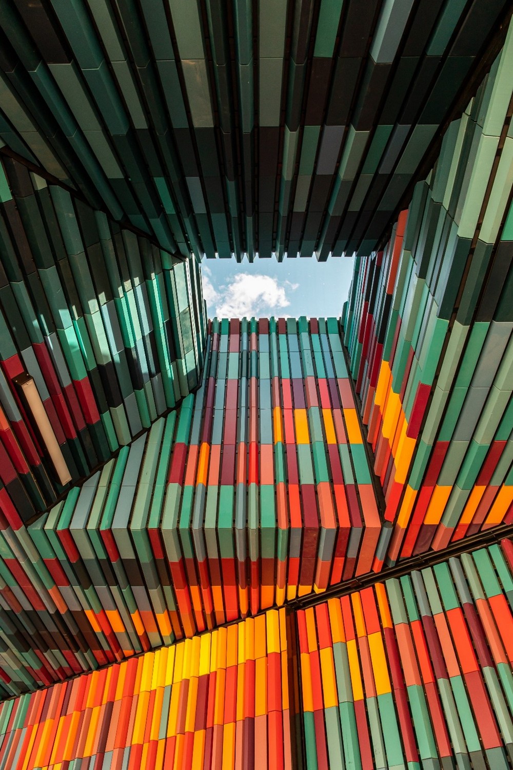
photo : Colourful Ceiling, Mitchell Luo, 2020, via Pexels
21 December 2021
Light affects how we perceive colour, making them highly interrelated. Therefore, it is important to understand how your application of light can affect the perception of colour in your architecture. Below are some of the main aspects that you must consider when integrating light and colour into your designs.
How Light Affects Colour in Architecture
Light defines how we see colour. The colour of a wall or structure will look different the moment you change the type and colour of lighting on it. Light can therefore alter our visual impression of colour. Some of the qualities and features of light that may affect colour in architecture include the following:
· The Colour Rendering Index (CRI)
When incorporating light in your design, it is important to know the colour rendering index of the light fixture you are purchasing. The CRI is a measure of how accurately a light source depicts the true colours of the object it illuminates. Natural daylight is considered to have the maximum CRI value of 100, and every light bulb is measured comparatively against this value.
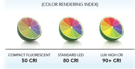
Projects Lighting, LEDNews, via Pinterest
Why is the CRI value so important in architecture? Unless you’re trying to change the hue of the objects or structures you are illuminating, you should go with a light bulb with a CRI value of over 80. When highlighting intricate architectural details or unique designs, a CRI value of 90 and higher is advisable. It is for this reason that CRI is highly considered when selecting picture lights and accent lighting, since higher values will enhance the colours used and bring out the textures and patterns on the surfaces. As a result, colours will look bolder and brighter.
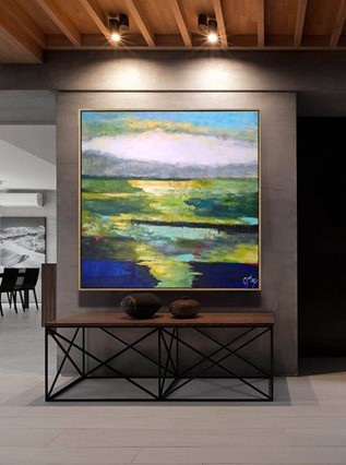
Abstract Painting, Etsy, via Pinterest
· The Correlated Colour Temperature (CCT)
Another fundamental light specification when it comes to the lighting of architecture is the colour temperature of the light. This measures the warmness or coolness of the light emitted, against a Kelvin scale. For instance, a 2700K light source will produce a warm glow that sets a relaxing and intimate mood, perfect for residential settings.
On the other hand, a 4000K bulb will produce a more neutral white, while a 6500k bulb would generate a cooler light that is great for industrial applications. The correlated colour temperature generally sets the mood and ambiance of the space. The values on the Kelvin scale replicate the glow generated by Carbon when heated at various temperatures.
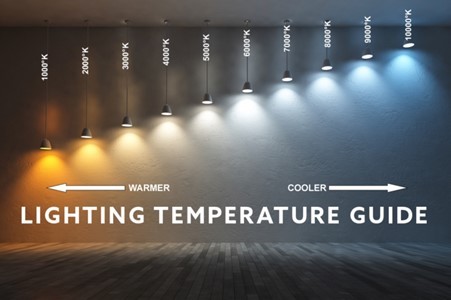
Colour Temperature, American Green Lights, via Pinterest
In regard to how the colour temperature of your light source affects the actual colours in your architecture, warm lighting enhances warmer colours such as reds, oranges, and yellows, while cool lighting would make cooler colours such as blues and greens look more vibrant. A neutral white colour temperature creates a good balance between the warmer and cooler colours. Therefore, depending on the colour of your structure or painting, it is essential to select the most suitable colour temperature.
· Light Intensity
In lighting design, the illuminance level is a primary concern when lighting for functionality. Depending on the use of a space, there are standard recommended illuminance levels that you need to meet to ensure visual comfort and safety for any tasks undertaken in that area. Light intensity also affects colour in architecture.
Low-intensity lighting will generally make colours appear visually darker than they actually are. As your lighting levels increase, the colour will be depicted more accurately, after which increasing the lighting even further will make it look washed out. Therefore, getting the right light intensity is key.
Impact of Surface Qualities on How Light Influences Colour in Architecture
In addition to the several attributes of light that affect colour, understanding how various surface qualities influence how colour reacts under different lighting conditions is very crucial. Let’s look at some of the most critical surface attributes that may affect colour:
1. Surface Reflectance
The reflectance of a coloured surface is a measure of how much light is absorbed by the material, and how much light bounces off the surface. So, how does this affect the perception of colour? Highly reflective coloured surfaces appear darker and more saturated under optimum lighting compared to surfaces with low reflectivity. However, when surfaces with high reflectivity are exposed to high-intensity lighting, there may be glare where too much light is reflected from the surface. With that in mind, here are a few factors to consider:
· Surface Glossiness
Glossy surfaces are considered to have higher reflectivity than matte surfaces. Therefore, glossier surfaces will tend to have deeper and more saturated colours compared to matte surfaces under the same lighting.
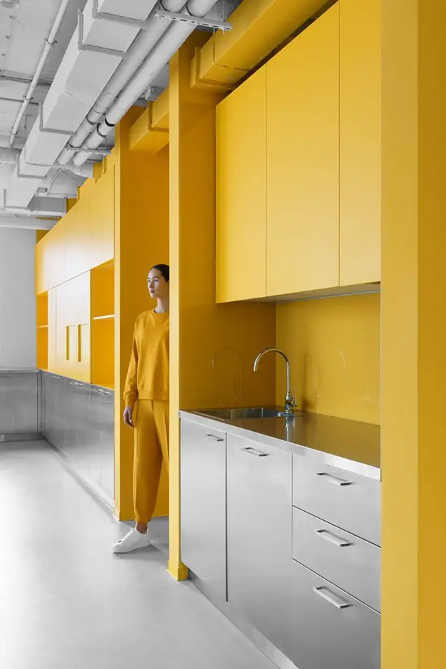
Appodeal’s Minsk Office, Design Milk, via Pinterest
· Surface Roughness and Smoothness
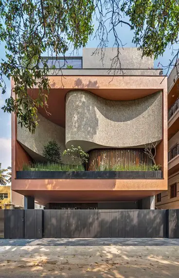
Urban Home in India, Architectural Digest, via Pinterest
When lighting rough and smooth coloured surfaces, it is important to remember that they react differently under lighting. Rough surfaces often appear duller and less saturated since they scatter light in a more diffuse reflection. Smoother surfaces are visually richer in colour since they result in a specular reflection when illuminated.
2. The Surface Colour Properties
If you are familiar with the principles of light, then you do understand that colour is simply light energy perceived at different wavelengths. When a light ray refracts through a glass prism, it generates the seven colours of the rainbow, each with a different wavelength. As such, the following surface colour properties will affect how a person perceives architectural colours under lighting:
· The Surface Hue
Colour has a great influence on the psychological state of the occupants in a room. Research has shown that warmer colours such as red, yellow, and orange have an energizing and radiant effect. On the other hand, cooler colours such as greens and blues are considered more relaxing and soothing. However, trends have seen the skillful combination of both warm and cool colours on building façades and interiors to create a more playful look. This has to be done with lots of careful consideration because if poorly applied, it can be overbearing and cause visual fatigue.
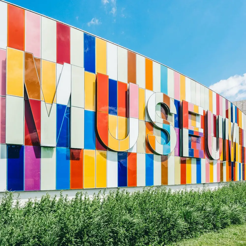
Multicoloured Museum Sign, Scott Webb, 2016, via Pexels
Under lighting, different colours with the same saturation will retain their respective true colours in white light. However, as earlier discussed, the colours will appear visually different under lights with different colour temperatures. Similarly, higher lighting levels will make the colours look brighter.
· The Colour Value
The colour value defines the level of lightness or darkness of a colour in a constant hue. The tone of a given colour can be referred to as its shade when it’s darker, or its tint, when it’s lighter. Generally, the more white you add to a colour, the lighter it becomes, while the more black you add to it, the darker it gets.
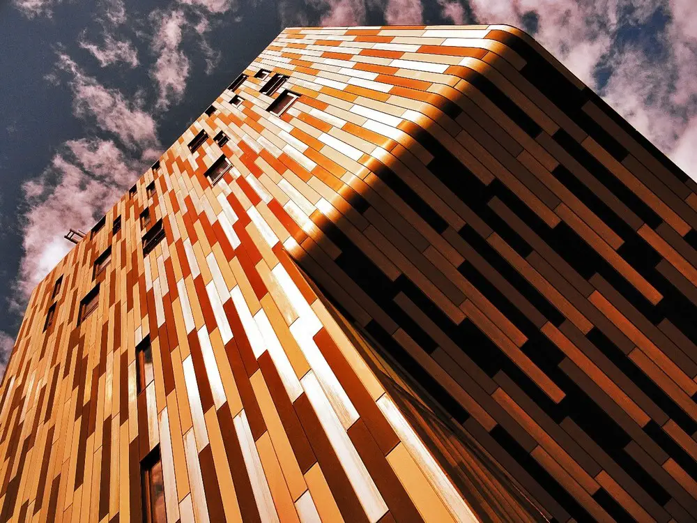
photo : Orange Bricked Establishment, SevenStorm JUHASZIMRUS, 2014, via Pexels
As such, when illuminated, lighter colours tend to reflect more light than darker colours, which instead absorb more light. This might therefore be a major consideration when selecting bulbs with adequate lumens to illuminate spaces or structures painted with different shades or tints of a colour. The lighting intensity required will certainly differ.
3. Other Factors to Consider
Many other factors influence the interaction of light and colour in architecture. The above are just the tip of the iceberg. For instance, when using directional light to accent an architectural feature, the angle at which the light is directed to the coloured surface will affect the appearance of the colour. According to Science, the angle of incidence of light is one of the factors that affect the reflection from a surface. That is why picture lights are usually aimed at a 30-degree angle from the artwork to minimize glare.
Other than the influence on colour, it is important to always go for light fixtures that are highly energy-efficient. This will allow you to minimize energy costs as well as contribute to environmental conservation. LED light sources with adjustable and automated lighting controls are the most sustainable option to go for.
Light and Colour in Architecture Conclusion
Light and colour play fundamental roles in architecture. They not only increase the aesthetic value but also determine how we experience architecture. Since these two elements are highly correlated, you cannot simply focus on one without looking at the other. Light affects colour in various ways as seen above, influenced by the surface characteristics of the illuminated structure. A combination of all these factors creates such a wide variety of possible outcomes that you can integrate into your design.
Thanks to technology, lighting companies have now developed various virtual demo room software that allow you to test out different light fittings with adjustable settings. This enables you to see beforehand how your space or structure will look like under the effect of that light fixture.
Lighting design is a broad concept, but one that is highly essential in architecture. By mastering the above principles of how light and colour interact in your design, you can make light work for you, and achieve a transcendent effect on all your architectural designs.
Excerpt
Light affects how we perceive and experience colour in every application of architectural design. Master the principles and factors that influence how light interacts with colour in architecture.
Author’s Profile
Winny Okoth is a practicing Construction Project Manager and Interior Designer. She is also currently pursuing her Master’s Degree in Construction Project Management. Winny Okoth has a great passion for every form of design and has mastery of the principles of design. She also specializes in 3D visualizations for architectural and interior design renders.
Comments on this Light and Colour in Architecture: How Light affects Colour article are welcome.
Lighting Design
Outdoor Lighting Building Design
Outdoor lighting complements patio design
Outdoor lighting ultimate guide
Electrical services for outdoor lighting ideas
Buildings
Architecture
Comments / photos for the Light and Colour in Architecture: How Light affects Colour page welcome.