
What Makes an Architecture Firm’s Website Visually Impressive and Easy to Navigate
17 July 2026
A visually impressive, easy-to-use website starts with something simple: clarity. When you run an architecture firm, your online home has to work hard for you, and if you need help putting that together, contact DesignRush before you start sketching your next layout.
Clear structure turns your site from a scattered portfolio into a place where visitors know exactly where to go and what to click.
Start With a Clear Homepage
Think about the way someone arrives on your site. They might be a potential client with 10 minutes between meetings, a journalist on a deadline, or a student looking for inspiration. All three want the same thing: a quick path to the right information.
Your homepage has to act as a guide. You need clear sections for projects, services, about, news and contact. Each section should be easy to spot immediately, with labels that use everyday language. If visitors have to guess what you mean, you lose them.
Keep Layouts Calm and Consistent
Once the broad structure is in place, your page layout does the next part of the job. Use a consistent grid across your main pages. This gives your images and text a stable framework and makes your site feel like a well-planned building.
Headings should be short and direct. Subheadings can add nuance, but they should still be easy to scan.
Use Typography That Supports Your Work
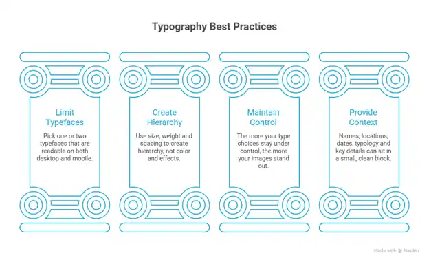
Typography plays a quiet but decisive role here. You do not need five fonts to look creative. Pick one or two typefaces that are readable on both desktop and mobile.
Use size, weight and spacing to create hierarchy, not color and effects. The more your type choices stay under control, the more your images stand out. Your project pages, in particular, benefit from clean type.
Names, locations, dates, typology and key details can sit in a small, clean block next to the first image. Visitors get the context right away, then move on to explore the visuals.
Organize Projects Like a Curated Exhibition
An impressive architecture firm website guides visitors through the portfolio like a curated exhibition. Let people browse by project type (housing, cultural, commercial, education) and by location or year.
Filters should be obvious and easy to change. A clear structure respects their time and makes your portfolio feel rich.
Build Project Pages With Simple Sections
Each project page is another chance to show how clarity works. Start with a strong hero image that really captures the character of the building. Then break the rest of the content into short, readable sections.
You can use headings like “Concept,” “Challenges,” “Materials” and “Outcome.” Keep paragraphs tight. Avoid abstract language and heavy theory unless your audience expects it. Many visitors will be clients or partners, not architecture critics. They want to understand what you did and why it matters.
Tell a Visual Story With Your Images
Images need structure too. A visually impressive site does not throw photos onto the page and hope for the best. It tells a story in a sequence.
Begin with exterior views to set the scene, follow with interior shots to show atmosphere, and then add details that highlight craftsmanship.
Make Navigation Obvious and Friendly
Navigation ties everything together. Menus should be obvious without being loud. A top bar with clear, single-word labels works well: Projects, Practice, News, Contact. Avoid clever labels that confuse people.
A visitor should never have to guess where something lives. If your site is large, consider a secondary menu or sidebar on key sections. Breadcrumbs can help people keep track of where they are inside a deep portfolio.
On smaller screens, a simple, well-structured mobile menu is vital.
Use Search Only If Content Is Structured
If you have many projects, articles or news items, a basic search function can save time. But it only helps if your content is labeled well.
Good titles, consistent metadata and clear categories make search results more useful. Visitors will feel that your site “understands” what they are looking for, even though you are just being systematic behind the scenes.
Don’t Forget Speed and Mobile Comfort
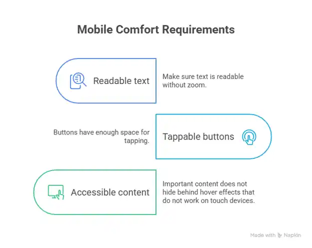
Speed and responsiveness sit quietly under all of this. A gorgeous project gallery that loads slowly or breaks on mobile is not going to impress anyone. Optimize your images so they stay sharp without being heavy. Test your layouts on different screen sizes:
- Make sure text is readable without zoom
- Buttons have enough space for tapping
- Important content does not hide behind hover effects that do not work on touch devices.
All visitors should feel comfortable browsing your website.
Speak Directly to Your Reader
Tone matters as much as structure. The copy across your site should speak directly to the reader. Speak like a confident, approachable professional.
For example, instead of saying, “Our firm has garnered numerous accolades,” you can say, “Our work has been recognized with awards from…” It is still professional, but it feels friendly and honest.
Conclusion
If your current site feels more like a patchwork than a well-planned space, start small. Review your main pages, your navigation and one typical project page. Then adjust labels, simplify layouts and tighten text. Show your architecture at its best and make visitors feel at home.
Comments on this guide to What makes an architecture firm’s website visually impressive and easy to navigate article are welcome.
Construction
Recently added Building posts
How to achieve dark sky friendly outdoor lighting
How to choose right contractor for industrial construction project
Why modern architects prefer minimalist carpets

++
Building Articles
Residential Architecture
Comments / photos for the What makes an architecture firm’s website visually impressive and easy to navigate advice page welcome.


