
When Colour Goes Quiet, Texture in Interior Design Takes Over
2 July 2026
As neutral palettes move beyond flat white into off-white, putty, stone, and softened grey, the decision that carries a scheme often shifts from colour to surface. With less contrast coming from hue, texture has to supply depth, shadow, and pace. For architects, interior designers, and specifiers, the question becomes practical rather than decorative: where should relief, grain, weave, and finish sit so that a quiet room still has structure?
Why Texture in Interior Design Matters More When Colour Goes Quiet
When a palette spans four near-neutral tones instead of a dozen, the eye has fewer colour cues to read, so it starts reading surface instead. That is where texture in interior design earns its keep. It works on two channels at once, and both are active before anyone lays a hand on anything.
Two Channels: Visual and Tactile
Tactile texture is the physical relief of a surface: smooth, ridged, grainy, nubby, or rough under the hand. Visual texture is how that relief reads before touch, through shadows, highlights, grain direction, and edge definition. In a quiet palette, visual texture becomes especially important because it gives the eye a route through the room when colour contrast is low.
Why a Quiet Palette Shifts the Load to Surface
That shift is not simply decorative. When strong colour contrast is removed, a room still needs hierarchy: one surface has to hold light, another has to soften it, and a third may need to absorb it. Texture supplies that hierarchy without asking the palette to become louder.
Reading a Surface: How Light and Touch Do the Work
Once those two channels are separated, the practical question is how a surface will behave in the actual room. A sample that looks strong under showroom lighting may disappear under diffuse daylight, while a low beam across plaster can make a shallow finish feel deep. Texture decisions should therefore be checked against orientation, window position, and primary viewing distance.
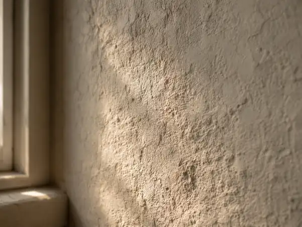
Raking Light and Relief
Light that skims a surface at a shallow angle catches every peak and drops every valley into shadow, exaggerating relief. It is why a coarse render or a heavy weave looks richest near a window in the morning and washes out under flat noon light. Placing textured surfaces where directional light will graze them, rather than hit them head-on, is one of the quietest ways to build depth without adding a single colour.
Sheen, Matte, and the Window as a Light Filter
Contrast between finishes does as much work as relief. A single reflective finish, whether a honed stone counter or a lacquered cabinet, reads far better set against something matte and irregular than against more of its own kind. Window textiles belong in this conversation too: a loosely woven sheer does not merely screen a view; it turns hard daylight into an even wash across the room, and the openness of the weave decides how soft that wash is. For early-stage mock-ups, designers can source fabric by the yard and hang a test length against the actual glazing before specifying full curtain drops.
Pairing Hard and Soft, and the Scale That Makes It Read
Texture works through contrast, not accumulation. Piling in more textured objects rarely reads as richer; it reads as busy. The move that carries a room is a deliberate pairing of opposites, held to a scale the space can support.
The Discipline of Contrast
A hard, precise surface needs a soft, irregular one nearby to register as a choice rather than a coincidence. Set a lacquered table on polished stone and the effect flattens; set the same table against handwoven wool, textured plaster, or softly honed stone and the contrast starts to carry the room. The rule of thumb is simple: for every smooth, reflective surface, give the eye a matte, broken one to land on.
Getting the Scale Right
Textural relief has to be proportionate to the space and to the surfaces within it, walls, furnishings, and window treatments included. Because texture visually fills a room, a bold, deep weave that anchors a large living space can overwhelm a compact room, where finer relief usually reads with more control. The check is viewing distance: coarse texture needs enough space to be seen as surface depth, while close relief works better where people sit near walls, curtains, or upholstery.
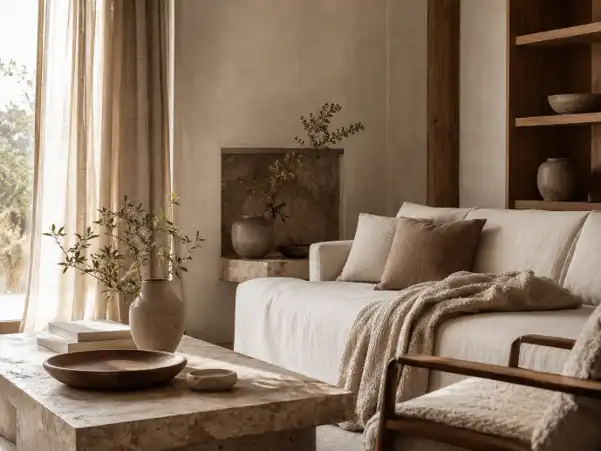
A Working Material Palette That Holds Texture in Interior Design
A palette that reads as considered usually resolves into three textural layers: a hard structural layer, a mid layer of furniture and rugs, and a soft layer of textiles. Each does a different job, and the tension between them is the point.
| Layer | Typical materials | What it contributes |
| Hard/structural | Honed stone, timber, limewash, brick | Anchors the scheme; holds and returns light |
| Mid | Rugs, upholstered pieces, cane, leather | Bridges hard and soft; carries daily contact |
| Soft | Drapery, throws, cushions | reaks up reflective surfaces; adds the matte, irregular counterweight |
In practice, a scheme loses its depth when one of these layers is missing, most often the soft one, which is the easiest to under-specify and the fastest to correct.
The Soft, Irregular Counterweight
The soft layer is where a restrained room usually earns its depth, and the more visible a textile’s weave, the more it pulls its weight. In drapery, loose upholstery, acoustic panels, or a single thrown length, coarsely woven natural textiles with open, nubby, or slubbed surfaces catch light unevenly and give the eye the broken surface that honed stone or lacquered panels cannot provide on their own. Against a hard, precise material, that irregularity is exactly the contrast that makes both surfaces read.
Handled well, texture is a sequence of calibrations: where light falls, how large the surface is, what the hand touches, and which material needs a counterweight. For architects, interior designers, and specifiers, that makes texture part of the material schedule rather than a late styling layer. In a room where colour says less, that calibration is what keeps a quiet palette from going silent.
Comments on this guide to When colour goes quiet, texture dominates interior design article are welcome.
Home Furniture
Home Furniture Design
How high-quality furniture adds property value
Home built-in furniture design

++
Property Articles
Residential Architecture
Comments / photos for the When colour goes quiet, texture dominates interior design guide page welcome.


